
In the world of branding, every detail contributes to the perception of a brand — from color and imagery to messaging and layout. However, one often underestimated element with immense influence is typography, specifically the font choice. The right font can define a brand’s personality, create memorability, and establish trust. On the other hand, an ill-suited font can dilute brand identity and confuse customers. But what exactly makes a font suitable for branding? Let’s explore the core elements that determine the effectiveness of fonts in a branding context.
Personality Alignment
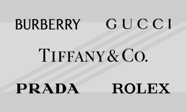
Fonts are visual expressions of tone and personality. A playful font suits a children’s toy brand, while a bold, geometric typeface might fit a tech company. The font should reflect the values, target audience, and tone of the brand. For instance, Coca-Cola’s script font conveys heritage and emotion, while Spotify’s simple sans-serif typeface communicates accessibility and innovation. A mismatch between font and brand personality can lead to customer disconnect or confusion.
Memorability
Great branding is about being remembered. A unique, well-designed font can help embed a brand in the consumer’s mind. Custom fonts or creatively modified typefaces are often used to set a brand apart — think of the instantly recognizable fonts used by brands like Disney, Google, or FedEx. These fonts are distinctive yet practical, reinforcing brand recognition at every customer touchpoint.
Versatility
A font must be adaptable to various uses and sizes without losing its visual impact. It should work well across both print and digital formats, in large headlines and small captions, and in different brand materials. Many branding guidelines specify multiple font weights and styles (light, regular, bold, italic) to provide flexibility while maintaining a cohesive look. A versatile font ensures brand consistency across all platforms and campaigns.
Timelessness
While trendy fonts may seem appealing, they can quickly become outdated, forcing a brand into unnecessary redesigns. A timeless font supports long-term brand stability and helps build trust with audiences. Fonts like Helvetica or Garamond, for example, have stood the test of time due to their clarity and neutrality. A timeless font doesn’t mean “boring” — it means carefully crafted to endure changing design trends while staying aligned with the brand’s essence.
See also: Harmonicode Sports and Its Future: Where Tech Meets Athletic Innovation
Cultural and Emotional Impact
Fonts carry cultural and emotional connotations. For example, a calligraphic font might feel romantic or luxurious, while a monospaced typeface could evoke feelings of precision or technology. A font suitable for branding considers these subconscious associations and uses them strategically. Global brands must also be aware of how their typography translates across different languages and cultures to avoid misinterpretation or offense.
Consistency and Ownability
Consistency in branding builds trust. Using a consistent font across all materials ensures visual harmony and reinforces identity. Moreover, a suitable branding font should feel “ownable” — either through a unique typeface or subtle customization. Some brands even invest in custom-designed fonts to fully own their typographic voice, ensuring no other brand can visually mimic them.
Conclusion
The right font does far more than convey words, it communicates a brand’s soul. It tells customers who the brand is, what it stands for, and why they should care. When chosen thoughtfully, a font becomes an integral part of a brand’s identity, capable of influencing perception, behavior, and loyalty. For businesses aiming to build a strong, lasting brand, typography is not a detail to be overlooked, it’s a decision that shapes the entire brand experience.